Job-o
Role at Job-O: I was the User Experience Designer and User Interface Designer at Job-O . Discover: Toronto-based startup Job-O was created as a response to the growing demand for jobs and companies looking for short-term hires. Their goal was to create an easy-to-navigate app that would alert workers of single-shift opportunities nearby. At […]

Role at Job-O:
I was the User Experience Designer and User Interface Designer at Job-O .
Discover:
Toronto-based startup Job-O was created as a response to the growing demand for jobs and companies looking for short-term hires. Their goal was to create an easy-to-navigate app that would alert workers of single-shift opportunities nearby. At the same time, they wanted to make sure they offered an easy and simple way for employers to post shifts and select the right candidates. Their target demographic was going to be users under 45 years old, with a main focus on users between 15-25 years old. While keeping this in mind, they also wanted to add a gamification factor to the application as well as make it interactive in an almost community-forming manner. The application would be generating profits through a small percentage of shifts and required three distinct user flows: the job seeker, the job poster, and the admin.
Defining Job-O:
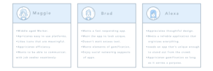
There were three main personas I took into consideration while planning the Job-O application experience. First, there was Brad, a 16-year-old high school student with zero job experience. However, he’s got good grades in school. He hasn’t committed to finding a job because navigating sites like craigslist can be monotonous for his teenage mind, and between classes and homework, he needs a job that doesn’t require him to commute too much. Then there was Alexa, she’s 23 years old and just graduated from university. She’s worked in the service industry and has various certifications. While keeping in mind that landing a career in the industry she studied can take some time, she wants to earn money still while not having to commit full-time. Finally, there was Maggie, she’s a 40-year-old business owner who constantly has employees calling in sick or has special events going on that she needs extra help. She wants to make sure she can hire someone with the right references and/or skills and that she can hire them quickly. The core desired experience for each of these personas is essentially very similar: quick, easy, and reliable. I wanted the application to be able to get as many people through the signup flow as possible and have them interact with the app in a way that keeps them on it for a longer period of time. The three-prong method I was using to spark this desire to use the application more was to make sure the rewards for using the app were easily understood, that communication between the app users was streamlined, and that the app had small elements of wonder within it.
Design of Job-O:
Foundational: I first began conceptualizing the brand image and feel, and the logo was where I started this process. Some of the logo design concepts were semi-abstract, others were in reference to the notion of a worker arriving, and other concepts were more location-pin centered.
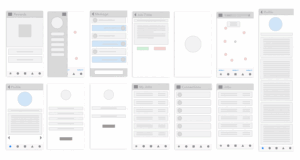
As I started designing the wireframes and putting together prototypes, testing out how the functionality and visual concepts would all come together, I would constantly return back to my personas so that I could create something that would delight both them and my client. The job seeker flow had to be something that both Brad and Alexa would feel comfortable with. It couldn’t include excess stimulus because that would potentially repel younger minds, and it had to be interesting enough that it doesn’t feel dull because that would also repel the users. Therefore, I made the signup process as simple as possible by first asking for very basic details so as not to overwhelm the user with an extensive form to fill out. Then, the app allows preferences to be picked from provided options to eliminate overthinking and to give job seekers other options they might not have thought of. Finally, the signup process has an easy-to-fill-in resume builder form, an option to upload resumes and an area to add extra notes and certifications. All of these sections are set up so that they can be edited at any time. Brad, who doesn’t have much to add to his profile, can easily add grades or other information he finds relevant in the extra notes area. Alexa can then easily add her previous experience and attach copies of her certifications to be quickly hired for the right position.
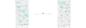
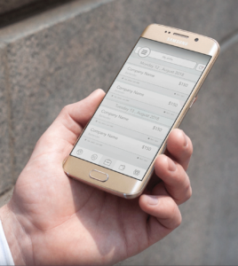
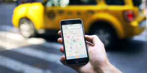
Once the job seeker then fishes the signup process, the first thing they see when they open the app will be potential jobs in the area, jobs they’ve favorited, as well as where their friends are doing nearby shifts. For the section on viewing jobs, I wanted to create a feeling similar to one of a modern file cabinet, organized, full of potential and evoking curiosity. There are star rating reviews for both employers and employees to create trust within the community, as well as options to add comments allowing both job seekers and job posters to feel more autonomous while using the app. The job poster flow design is even more straightforward as Maggie already has enough things preoccupying her time. They are guided through a basic fill-in listing form.
The rewards:
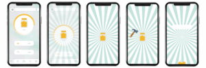
One of the core elements and differentiating factors of Job-O is its reward system. Since the application generates income from taking a small percentage from the users, incorporating a give-back nature lessens the chances of people wanting to potentially go around the app and fulfill jobs found through the system external from the system. So we devised an idea to create a virtual “money jar” that fills a little bit with each completed shift. Since the money jar has to be filled to a certain amount before it is able to be broken, this adds a level of intrinsic motivation to the application. For the most part, the application is bringing users to it for the extrinsic motivation of generating money. However, once there is an element of fun and challenge brought into it, intrinsic motivations also guide users to continue using the application. For the money jar concept, I created an animation that gamifies the rewards collection even further. Job shifts can also be referred between job seekers, and if one party accepts that shift, the other will be rewarded.

Messaging:
Another one of the core elements of the Job-O application is that there is a community built within the application through messaging. The internal messaging system within the application between job seekers and job posters respects users’ privacy and creates what are essentially receipts between their interactions. Job seekers can also connect with their friends and message them through the internal system. When they send their friends shifts, inside of the messages, they will easily be able to view if their friend accepted that offer or not and how much they earned for it. By creating this internal messaging system, a community is built within the app itself without having to rely on existing social media platforms. This social network of trust and motivation aims to provide real value to its users, which in turn makes them want to use it more.

Elements of Wonder:
At the end of the day, as a designer, I want to create something enchanting to use. The way I decided to go about this enchantment for Job-O was to add some elements of wonder throughout the application because, as I hope that the app will be used on a regular basis, I also don’t want it to feel cumbersome after an extended period. One of the ways I went about this was by incorporating simple yet thoughtful animations throughout the application. I began to imagine how the logo could move throughout the app, creating a sense of familiarity and association for the user. Then I imagined how the application’s background could change and move as the user works in different areas. Since a central focal point of the application was to be the map, I thought about how the map could act as a backdrop through a subtle double exposure effect on other pages as well. Therefore, as the user changes locations, the background will also always have subtle changes in it, creating a connection between the user and the application. I hope this invokes a bit of a notion that the application is there with the user during their journey through different shifts. The default colour primary colors of the app were chosen to give a clean, modern, and positive feeling. The pastel green-blue color can also be altered through the admin controls. The purpose of this function is to allow for more interactivity. When there are special holidays or events going on, Job-O can quickly trigger changes in the user experience and the user interface without affecting the usability or flow of the app.
Check out the Behance portfolio https://www.behance.net/gallery/72495179/JOBO
You Can check out my portfolio page